Back in 2014, a provocative article in Harvard Business Review claimed the inefficiency of marketing and sales funnels. Indeed, today there’s a huge number of ways people can learn and interact with a product. Instead of following a linear path towards a purchase, users choose their own unique trips and journeys. Sometimes they skip several sales funnel stages or purchase the products being in the middle of it.
This inconsistency isn’t marketers’ or salespeople’s fault. With loads of information around, you simply can’t track or control all the ways the targeted audience interacts with the products. They can read articles, study reviews, watch videos, consult with their friends, or accidentally hear about it in a line. You may ask: how, in that case, we can structure interaction with customers in the most effective way? Let’s figure it out.
In this post, we’ll look into sales funnels, learn how they work, and analyze how to transform them if you want to increase your profit.
What are Sales Funnels
First, let’s agree on what a sales funnel is and what role does it play in affiliate marketing.
Sales funnel is a certain path that customers follow before making a purchase. In addition to boosting sales, it’s also used as a mechanism for warming up leads and convincing them to take the required action: leave contacts, subscribe, or sign up. By creating a funnel, you prescribe all possible scenarios of your potential customers’ behavior and generate a set of tactics leading them to a specific goal.
No matter which business sector or marketing direction you’re specialized in, you should always remember about the basic stages of the buying process through which your potential customers will or may go. Linearly, selectively or chaotically. These stages are
- Awareness
- Discovery/ consideration, along with evaluation
- Intent
- Purchase
- Loyalty
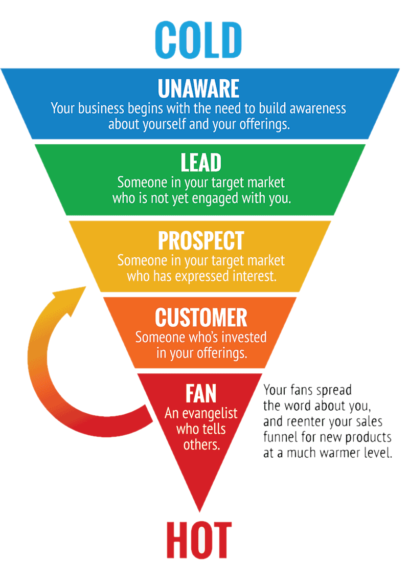
Basic affiliate marketing Sales Funnel
The basic affiliate marketing sales funnel consists of 3 main elements:
- Pre landing
- Thank you page
- A landing page
Pre-landing page
Pre-lander is a page that customers see before the landing page. It has several functions:
- warming up potential customers;
- getting off the unwanted audience from the landing page with a product offer;
- collecting contacts and users personal info;
- transfer users to the next funnel step (next pre-landing page/thank you page or the main landing page).
There can be various types of pre-landing pages. Some of them you can see more often in particular verticals and niches. But here, we won’t dive into the details and consider the most popular types in general.
Types of Lead Generation pre-landing pages:
- a well-designed page with strong CTA.
It should have a good structure and be straight to the point. Simply sell the reason why your customers should click on the button and follow the path you’ve created for them.
- a page with free valuable resources.
Offer free samplings, instructions, a book, a checklist or another informational product. The most important thing is that it should be of real value for the people you want to convert into customers.
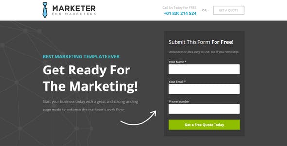
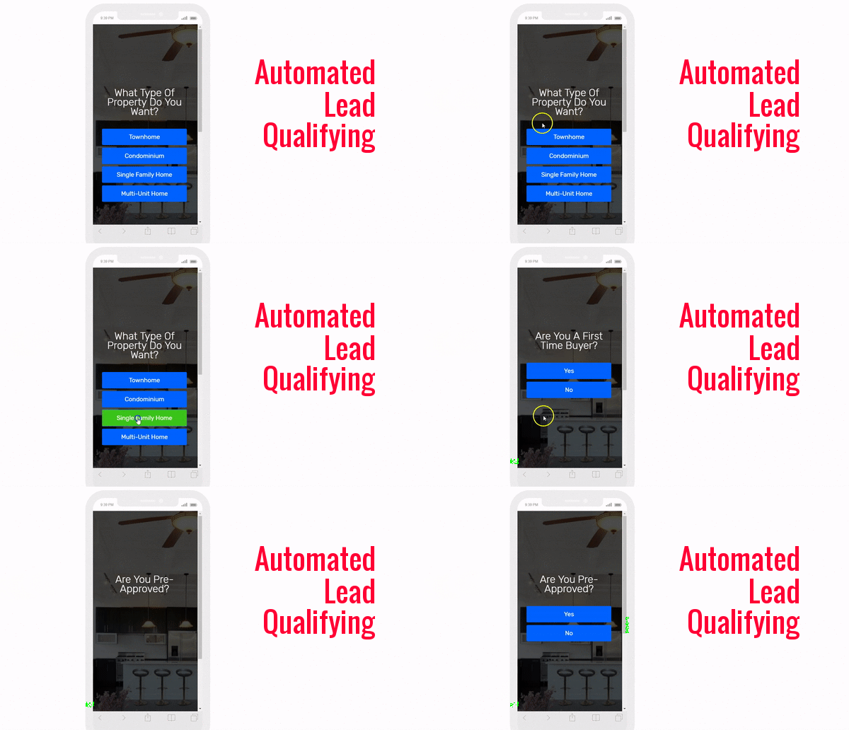
- a landing page with a questionnaire.
It kills two birds with one stone: helps you get rid of the unwanted customers, on the one hand, and get more info about the target interested audience. You may simply ask their age, sex, or build a chain of questions to establish a stronger contact.
- a gamified page.
According to TechValidate’s, 30% of companies that use gamification improve their registration CR by more than 50%. It can be leaderboards, progress bars, loyalty programs, or a simple quest. The secret lies in the ability to arouse human natural instincts: competition, exploration, and curiosity.
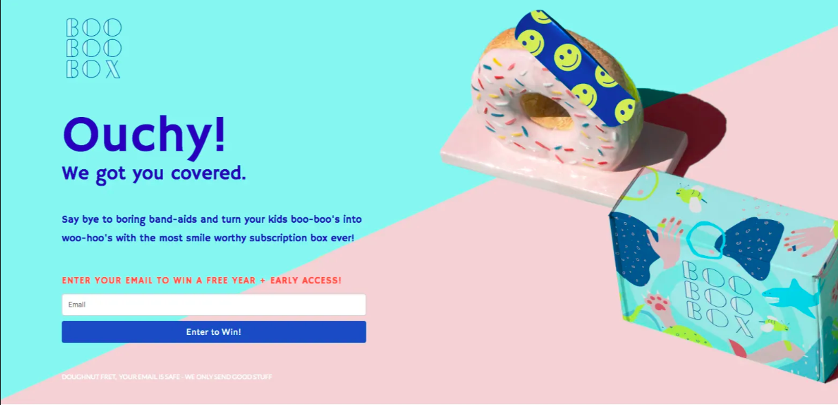
- a certain prize page.
Pages that offer you to participate in a prize draw if you leave contacts are heavily used in sweepstakes vertical but also well suited for others.
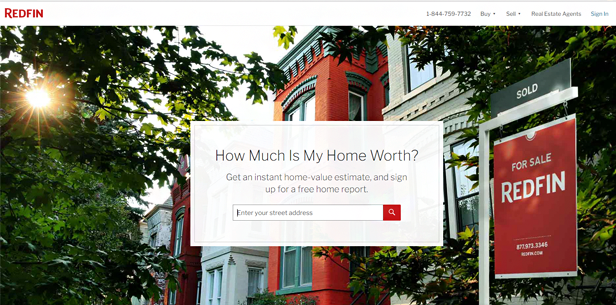
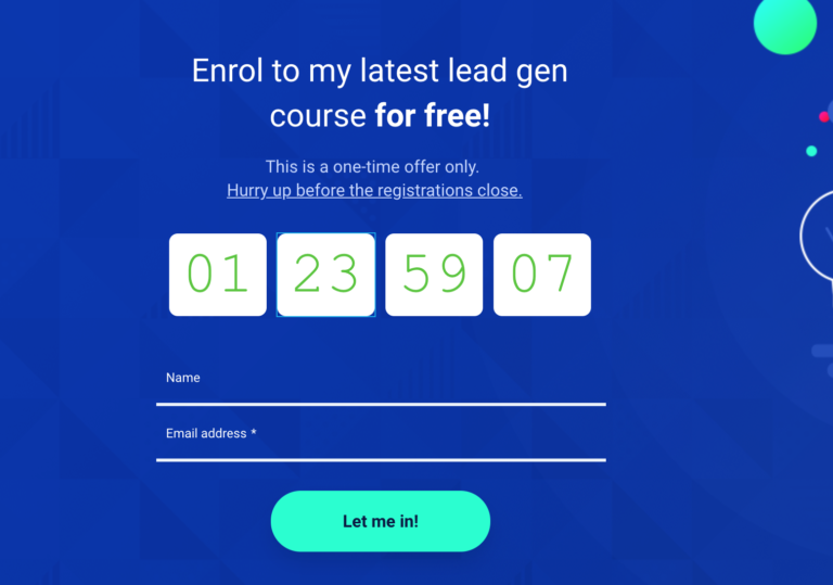
- a page with a sense of urgency.
The sense of urgency can be conveyed by time and resource limits. The typical keywords used to enhance the effect are ”now”, “today” or “latest”. For conversion rate, a combination of limited time for the special price works the best.
- antiviruses/ performance boosters

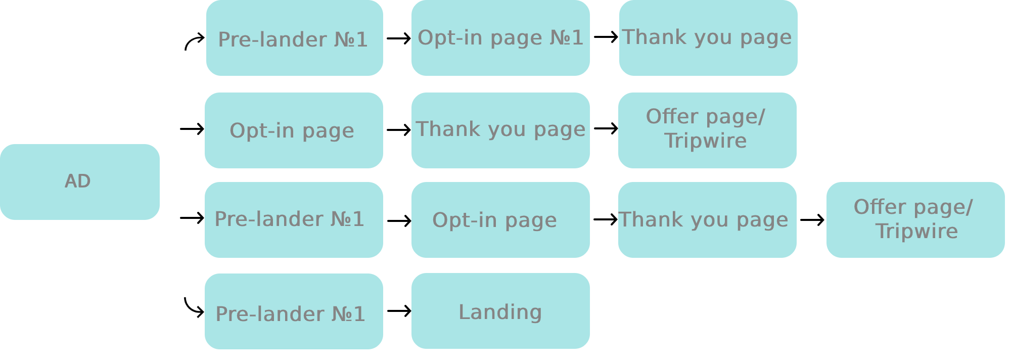
Some people are quick funnel lovers. They tend to minimize funnel stages and experiment with combinations instead. In our case, the funnel might look like this:
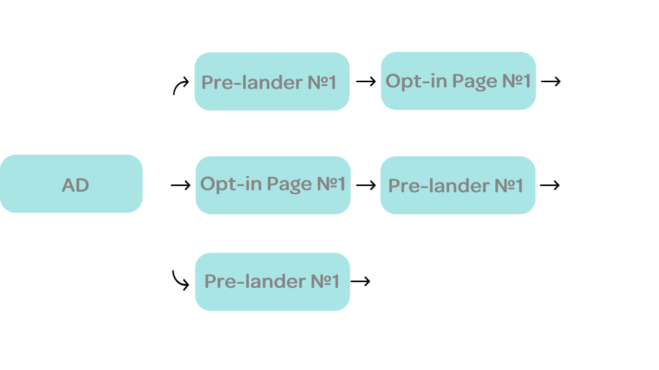
Top 3 tips:
- Always test different pre-landing and landing pages combinations. Test your hypothesis with minimum budget, use analytical and tracking tools, and compare metrics.
- Pre-landing pages are more effective when they include a thoughtful copy: headline, body, call to action, and footer.
- Working through combinations, keep in mind that the angle “what will change for the consumers with the product” is better than “this product is awesome and it does this and that”.
A thank you page
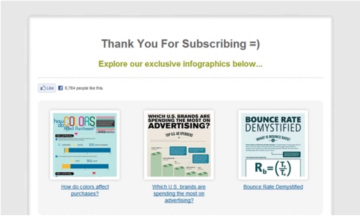
A thank you page is where you say thank you to your users for taking a specific action at the first stage. Here you can just be grateful for having your customers contacts or also provide them with the free valuable item they requested: eBook, check-list, video, infographics or etc.
A thank you page may be erroneously perceived as a formality. In reality, it’s the core stage of the funnel, the “impulse zone” as to say. It’s a kind of bridge where you start building trust with your potential customer.
A highly-convertible thank-you page consists of 3 main elements:
- A confirmation message;
- A clear call to action;
- Specific instructions on what a person should do next. Here you may want to move all the communication to emails.
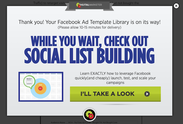
To monetize your “thank-you page” more effectively you can place:
– an offer/affiliate link near the bottom of the page
– an affiliate link near the bottom of the page
– a tripwire*
*A tripwire is a relatively painless low-cost offer that that’s sole purpose is to convert an audience into customers. This small offer helps accelerate the buyer’s journey by letting customers dip their toes in without having to make a big purchase. Then, once they see the value in that product they will be more likely to purchase the core offer
– the list of your offers or one offer
So, at this point we have
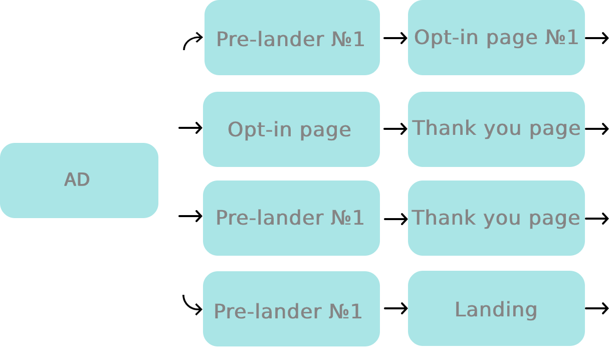
To track several landing pages in one campaign flow (LP 1 -> LP 2 -> Offer), use RedTrack Multi Landing feature. It was created due to the numerous requests of our customers who use complex sales funnels and want to measure the effectiveness of each stage.
An offer landing page
This is the page where you make money. Remember, that the best landing page is defined by the number of conversions, not by some subjective opinions and ratings. If you’re working with cold audience, prepare your re-targeting strategy: ads, emails, and experimential urgency campaigns.
Keep in mind that there’s no secret sauce that will make your page high converting overnight. But there are, of course, some tricks that statistically improve its CR:
Tips to create effective Landing Pages
- Catchy design with high-quality images and visuals:
Don’t try to hit the audience by demonstrating all the visual methods that you know. It’s better to stick to the concept of visual simplicity:
– focus customers attention on CTAs by isolating them from other elements;
– display and contrast key features and calls;
– place elements in a way that directs users to keep reading.
- Tight, convincing copy:
The formula is simple. If you don’t know what to write, simply answer the following questions: What product do you sell? What does it do? Why is it valuable to your landing page visitors? What should these visitors do next and what they should expect?
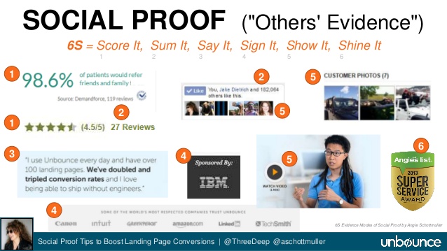
- Social proof:
There are several forms of social proof that you may display on your landing page. Among them are testimonials, reviews, case studies, customer showcases, celebrity endorsements, number of shares, number of customers/ users and others
- Well formulated value proposition:
A value proposition is a clear statement that describes the benefits of what you are offering, how you solve needs and your visitor’s problems, and what distinguishes you from the competition. The distinctive features of effective VP are differentiation, quantified value, and relevancy. When it comes to landing pages, it should be conveyed in the first 10 seconds.
- Video demonstration:
– Explainer Videos
– Testimonial Videos
– Video Backgrounds
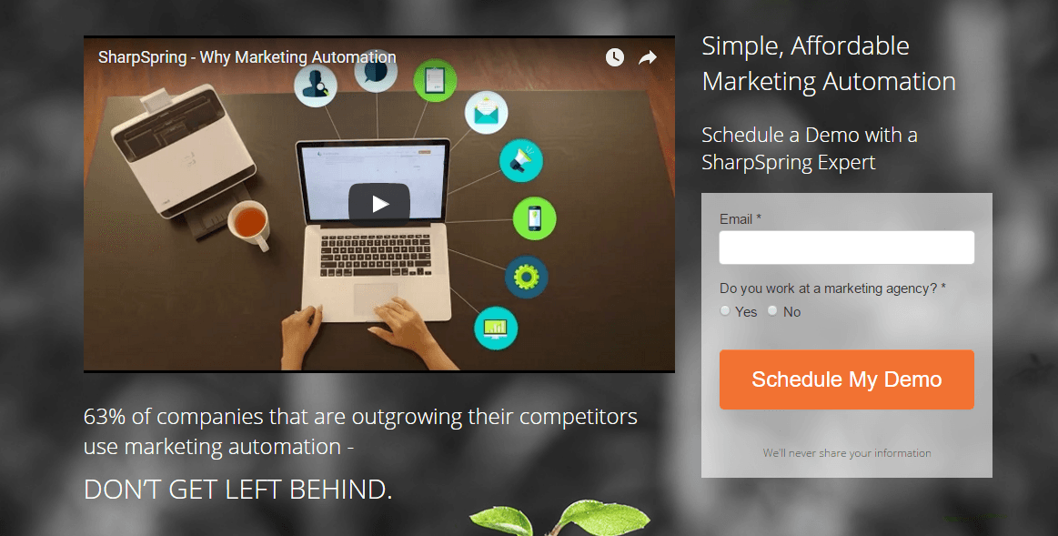
But what’s important, first, make sure your video doesn’t slow down your landing page and it doesn’t distract users from your call to actions:
Conclusion
No matter which kind of strategy you’ll choose or how many elements will your funnel include, the key to success is to build relationships with users. It’s difficult to persuade someone to buy something from you if there’s no trust between you two. Especially if we are talking about expensive goods. Trust is a strategic investment that will help you monetize one audience several times. The rule of thumb is that it’s always cheaper to retain a customer than acquire a new one. Some claim that acquisition is typically seven times more expensive than retention.
As you see, a basic affiliate marketing sales funnel inherently is not much different from the standard marketing one. It likewise suggests a buyer passing through all the stages of any buying process: from acquisition (ad) to retention. It’s technologies, instruments, and the external factors that are changing over time, but human nature stays the same.
To make sure you’re right in what you are doing, track all your potential customer’s impressions, clicks, and conversions. Test, look for patterns, improve it and do it all over again. Without a doubt, it’s not an easy process. But RedTrack is always ready to help you.


